Portfolio Case Study · Concept Product
Signal — AI Trust Layer for Social Media
A product concept focused on helping people recognize AI-generated and misleading content while scrolling social platforms. The work moved from product definition and notebook sketches into AI-assisted exploration, low-fidelity wireframes, high-fidelity UI, and a mobile prototype for three connected experiences: the AI detection social feed, the onboarding layer, and the Signal app control center.
Project snapshot
Making trust signals visible in the moment people need them most.
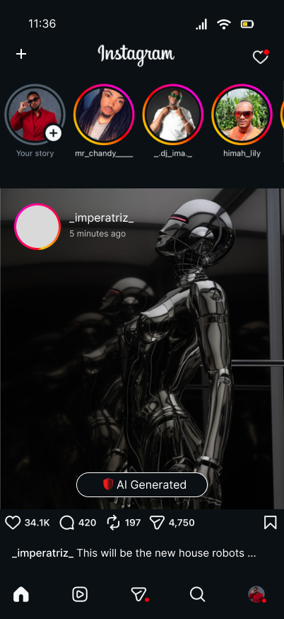
The concept envisions a lightweight trust layer that operates across platforms like TikTok, Instagram, and YouTube, flagging potentially risky content in real time while giving users a private space to review detections, trends, and platform-level controls.
Overview
What this project set out to solve
Social content moves fast, while trust cues are often invisible, inconsistent, or buried behind reporting flows. Signal explores what a more proactive experience could look like: one that flags questionable content during consumption, explains what is being detected, and lets people tune the system without adding friction to their everyday browsing.
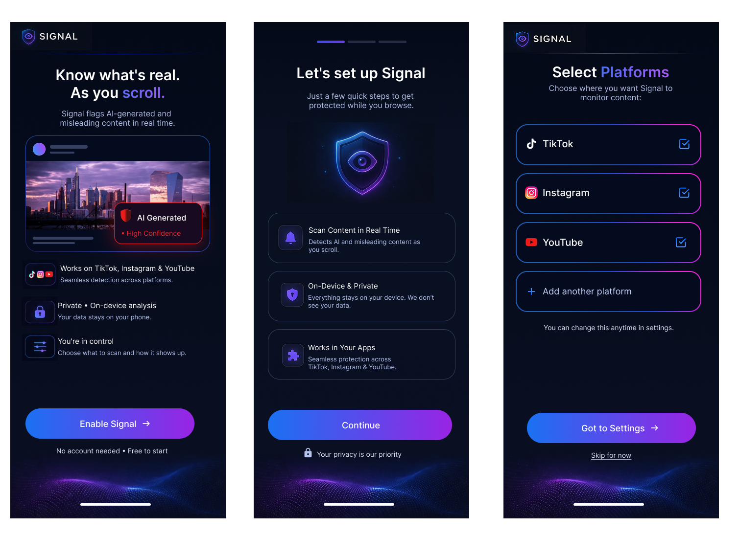
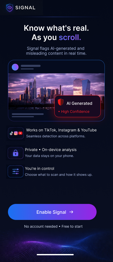
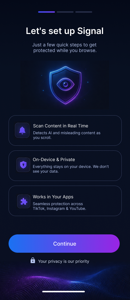
The concept was structured around a connected ecosystem rather than a single screen. That led to three main product areas: the in-feed detection layer, a simple onboarding experience that explains value and permissions, and a control center where users can review history, monitor trends, and manage platform settings.
Workflow
From product definition to prototype
The process was organized to keep strategy, exploration, and UI execution connected. Product definition established the problem space, early sketching opened up directions quickly, and the later wireframe and prototype phases focused on refining how trust signals appear, how onboarding reduces uncertainty, and how the control center helps people understand what Signal is doing over time.
Phase 01
Product definition in FigJam
The first step was clarifying what Signal actually is: an AI trust layer for social media, not a replacement social app. This phase defined the audience, core value proposition, likely user concerns, and the relationship between passive detection, lightweight education, and user-controlled settings.
- Defined the product as a background layer that works across existing platforms.
- Framed privacy and control as primary trust builders, not secondary features.
- Separated the experience into feed detection, onboarding, and control center surfaces.
Key design principle
Trust tools need to feel clear, private, and calm. The product direction avoided alarm-heavy UX and focused instead on readable signals, confidence indicators, and simple review paths.
Phase 02
Sketch phase: notebook first, AI comparison second
I began with notebook sketches to quickly map layout hierarchy, content grouping, and how a trust layer might appear on top of a social feed. After that, I explored AI-generated sketch directions to compare where prompting could speed up iteration and where manual sketching still produced stronger structure or clearer intent.
- Manual sketches helped define product logic and task flow.
- AI-generated sketch exploration was used as a comparison tool, not a replacement for design judgment.
- The comparison revealed which ideas were worth carrying into wireframes and which needed simplification.
Manual sketches
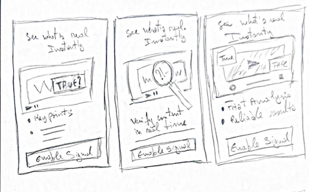
Focused on flow, hierarchy, and simplifying interactions before moving into digital design.
AI-generated sketches
Used to rapidly explore alternative layouts and challenge initial assumptions.
What manual sketching was best for
Clarifying user flow, deciding what appears first, and reducing unnecessary UI before committing to digital frames.
What AI exploration was best for
Opening alternate layout directions fast, pressure-testing assumptions, and generating additional visual variations for review.
Phase 03
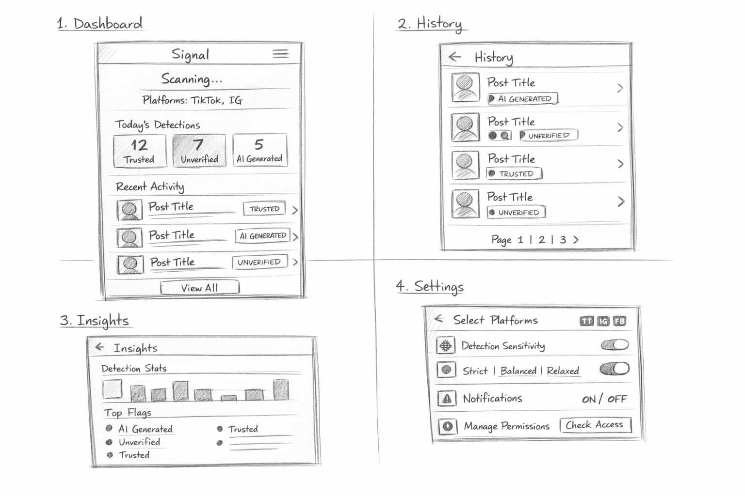
Low-fidelity wireframes
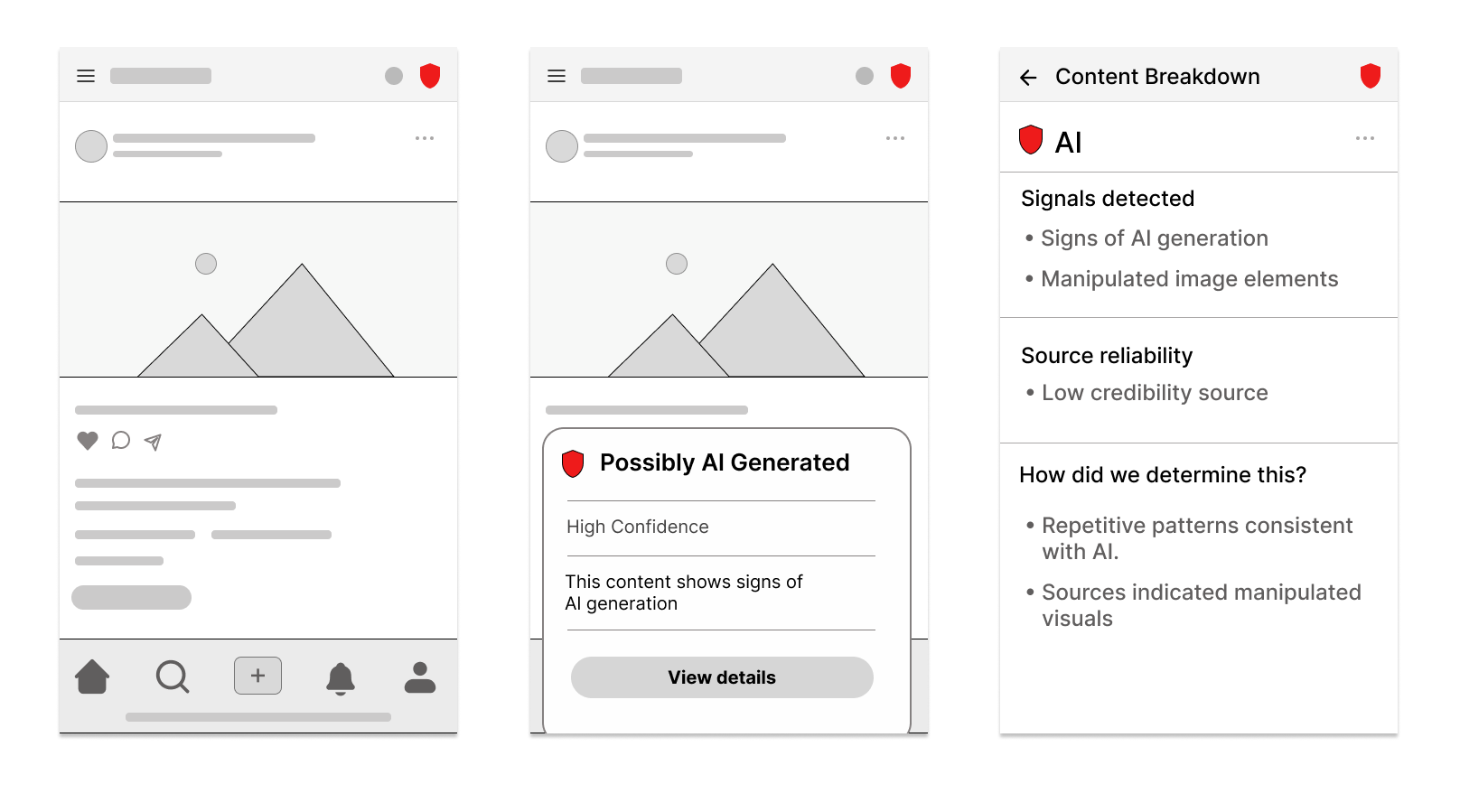
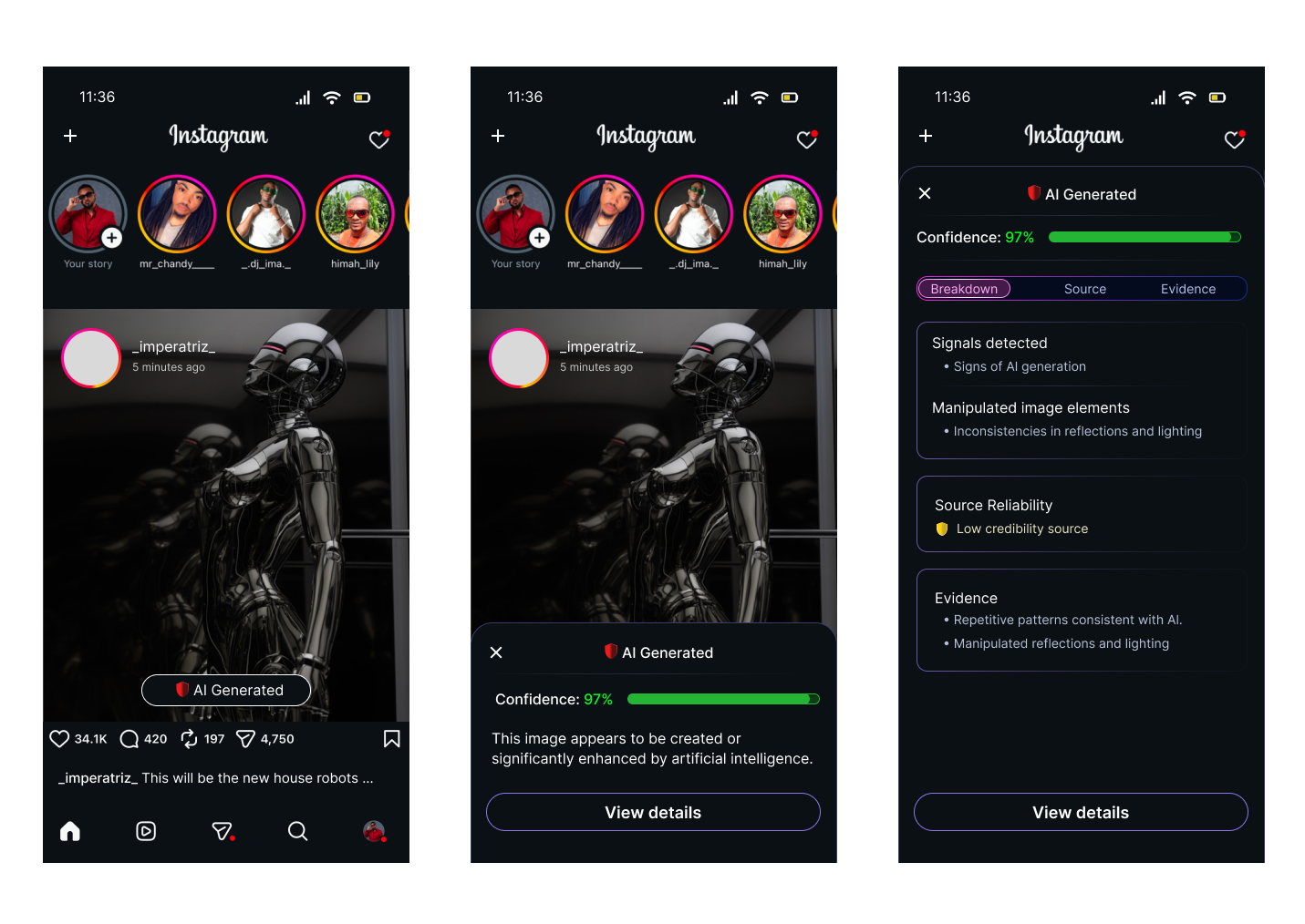
The low-fi stage focused on structure and task flow. At this point the goal was not visual polish, but making sure each product area did one job well: detect in context, onboard with clarity, and summarize activity in the control center.
- Mapped a feed-level trust badge and flag state for in-context review.
- Simplified onboarding into quick, confidence-building steps.
- Defined the control center as a destination for trends, history, and settings rather than a dense dashboard.
Low-fi priorities
- Clear information hierarchy
- Short onboarding path
- Repeatable navigation across app sections
Phase 04
High-fidelity wireframes
Once the architecture felt solid, the high-fi phase translated the system into a stronger point of view. The UI adopted a dark, neon-accented visual language to reinforce ideas of scanning, signal strength, and technical confidence while still keeping the interface legible and mobile-friendly.
- Used color intentionally to communicate confidence, status, and category.
- Introduced a visual system consistent across onboarding, history, insights, and settings.
- Balanced high-tech aesthetics with readable spacing, card structure, and focused content density.
Visual language
Blue-to-purple gradients, neon outlines, and dark surfaces helped connect the product metaphor of scanning and signal analysis without making the UI feel chaotic.
Phase 05
Prototype in Figma and Figma Make
The prototype phase focused on flow clarity and interaction continuity. Parts of the system were refined in Figma, while other directions were accelerated through Figma Make to test how quickly the experience could be assembled, refined, and communicated as a more complete narrative.
- Connected the onboarding path to the control center.
- Demonstrated how users move from setup into live monitoring and review.
- Used prototyping to validate transitions, section relationships, and perceived completeness.
Prototype outcome
The final experience reads as a connected product, not isolated mockups: users can understand what Signal does, choose where it works, and review detections in one coherent flow.
Experience architecture
Three product areas shaped the full system
All design phases were organized around three connected areas. This made it easier to keep the project grounded in user value instead of designing disconnected screens.
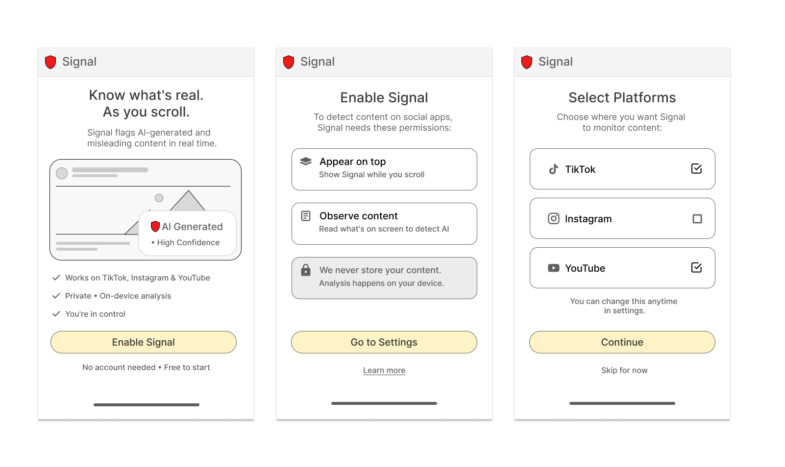
Onboarding layer
Build trust before asking people to enable the product
The onboarding flow was designed to reduce skepticism and explain value before asking users to change any settings. The sequence introduces what Signal does, reinforces that analysis stays private and on-device, then lets people choose where the trust layer should appear.
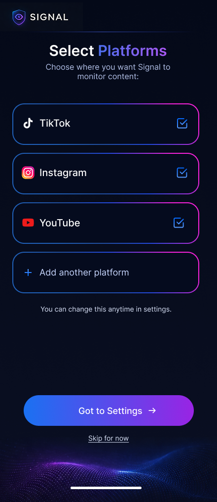
Why this sequence works
For a trust product, asking for access too early can feel contradictory. This flow earns confidence first by making the benefit visible, framing privacy as part of the product promise, and delaying setup choices until the user understands the system.
Interaction principles
Each screen focuses on one decision only: understand the value, understand permissions, then choose platforms. Large cards, short copy, and a single primary action keep the flow quick while preserving a sense of user control.
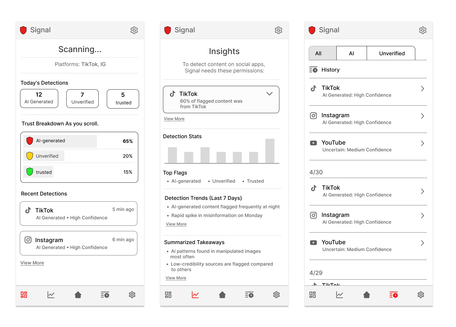
Signal app · control center
Turning invisible background analysis into something people can actually understand
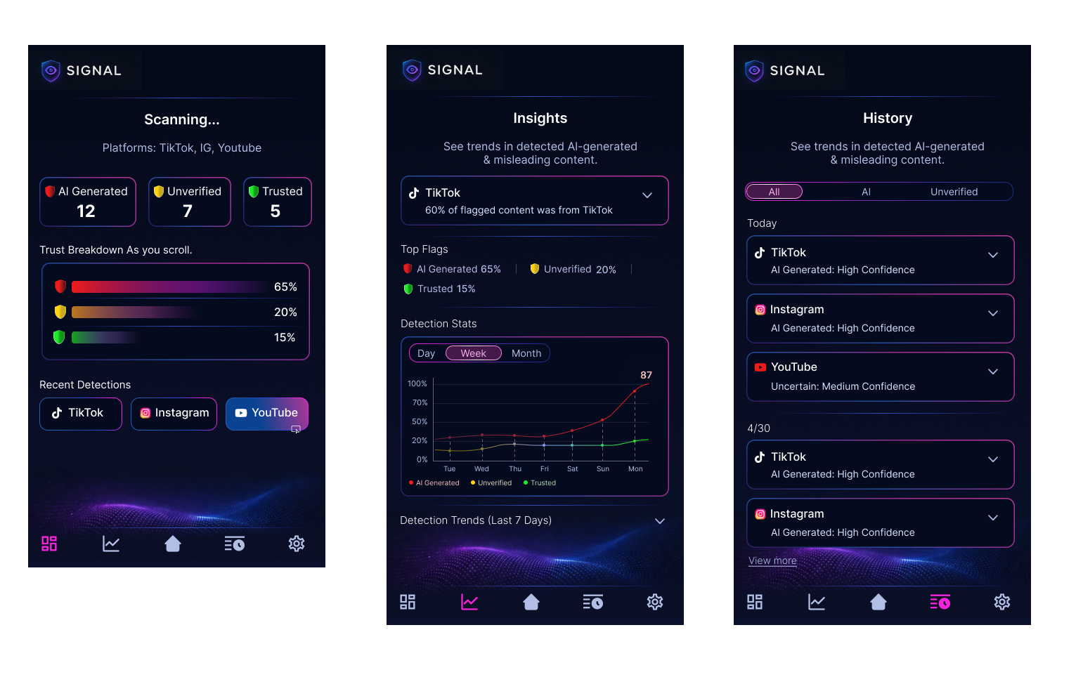
The control center gives Signal a home beyond the feed overlay. Instead of showing isolated detections, it helps users review what was flagged, understand confidence levels, and see how trust signals accumulate across platforms over time.
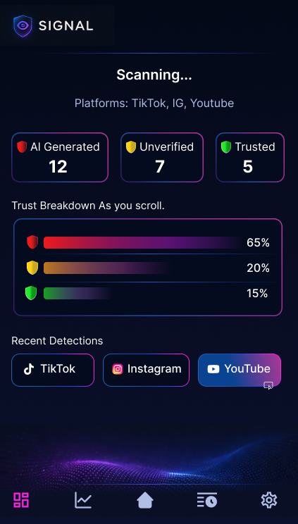
01 · Dashboard
A fast daily snapshot while scanning is active
The dashboard is the landing state of the product. It summarizes live monitoring with clear counts for AI-generated, unverified, and trusted content, then translates those counts into a simple visual breakdown users can read at a glance.
- Supports quick comprehension with large headline metrics.
- Uses consistent color coding so categories stay readable across the product.
- Highlights recent detections by platform to connect analysis back to real apps people already use.
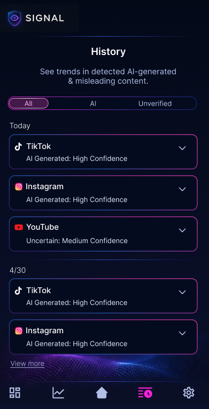
02 · History
A traceable record instead of one-time warnings
History gives users a place to revisit flagged items after the moment has passed. Grouping detections by platform and confidence level makes the system feel more accountable and gives users a way to verify that Signal is working consistently.
- Accordion rows keep detailed information available without overwhelming the default view.
- Filters help users focus on all results, AI-related detections, or unverified content.
- The layout supports future expansion into item-level detail, source checks, and explanation states.
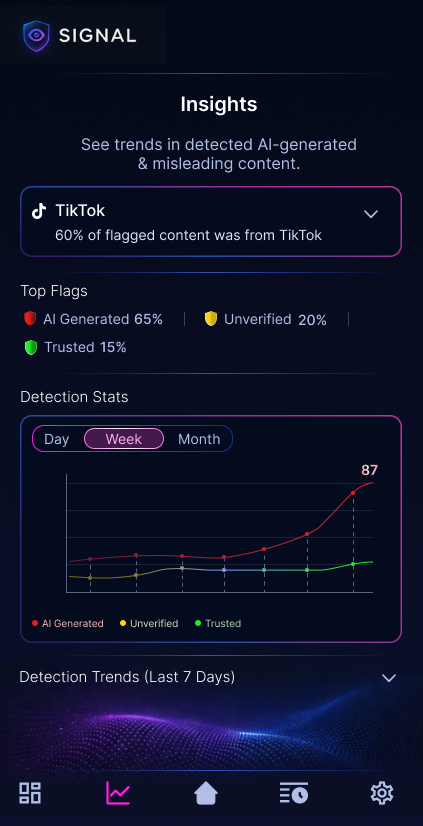
03 · Insights
Pattern recognition, not just detection logs
The insights view shifts Signal from a reactive tool into a learning tool. By combining top flags, platform emphasis, and trend charts, the interface helps users understand how content quality changes over time instead of treating each alert as an isolated event.
- Trend views create a stronger sense of product intelligence and ongoing monitoring.
- Top flag summaries make the most common risk categories immediately visible.
- The visual system stays aligned with the dashboard so the experience feels connected, not screen-by-screen.
UI evaluation
What makes the final UI feel cohesive
Consistent trust language
The same colors, icon patterns, and confidence framing carry across dashboard, history, and insights, which helps the product feel dependable.
High-tech, but still readable
The dark neon visual direction supports the AI-scanning concept, but spacing, card hierarchy, and restrained copy keep it from becoming noisy.
Built for future depth
The structure leaves room for deeper explanations, source validation, custom settings, and more advanced detection views without needing a redesign.
Project reflection
What this case study highlights
System thinking
The project goes beyond single-screen polish and shows how a product concept can be structured as an ecosystem of connected surfaces.
AI + human workflow
The process documents how notebook sketches and AI-assisted ideation can work together, with design judgment guiding what moves forward.
Execution range
It demonstrates strategy, flow design, wireframing, high-fidelity UI, and prototyping within one cohesive case study story.
Process & Artifacts
Explore the full design process across research, wireframes, and final prototype.